Here is a playful spread I produced for an as-yet unwritten cat story aimed at 5-8 years. Again playing with type to show how a story can meander along in a more fun way, whilst drawing more cats!
Saturday, 23 August 2014
Children's book spreads for Piano & the Boy
Ancient Egypt educational resources for children
This is a set of educational work I was commissioned to design and illustrate for Key Stage 2 pupils. It taught fact form Ancient Egypt in a fun and colourful way, featuring many activities to complete!
Lego Portal App Branding and Concept
This is a proposal for a Lego app for children. It takes the physical lego bricks we know and love and scans them into a virtual world where challenges and tasks are undertaken. Instead of the construction being the main selling point of Lego set, with my proposal it is only the beginning.
Monday, 18 August 2014
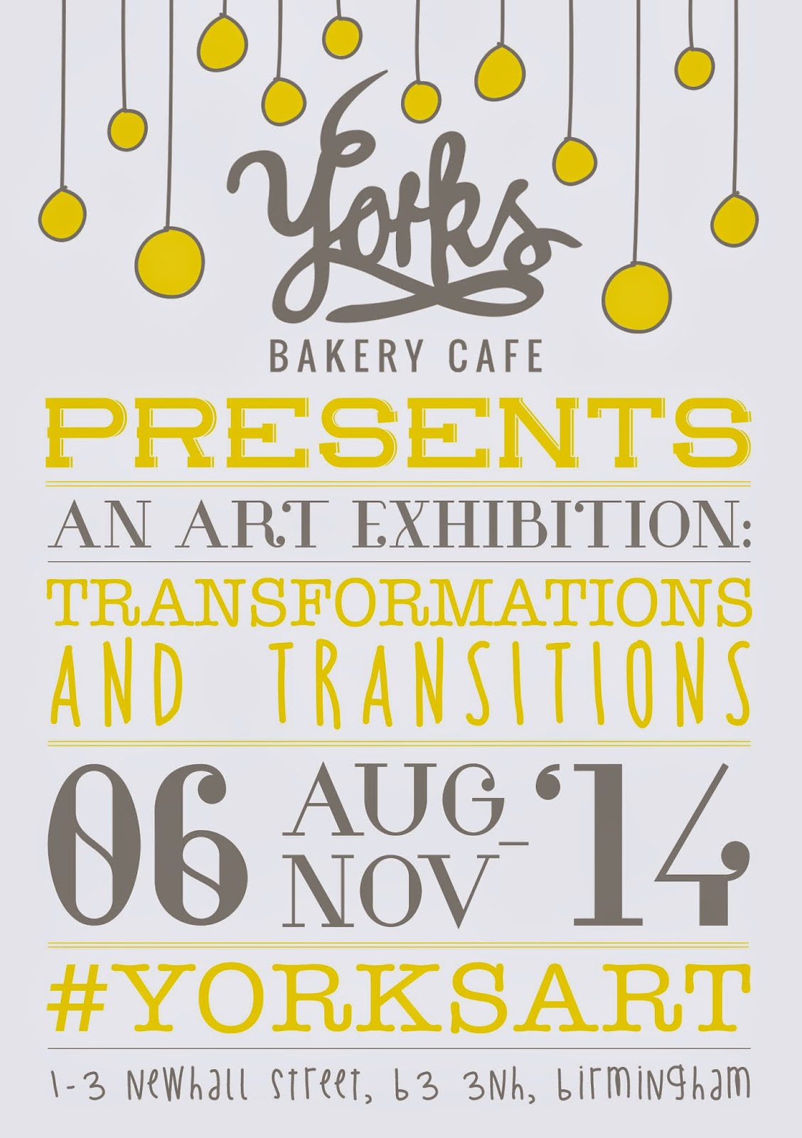
Yorks Art Exhibition Flyer!
I took a typographical approach to this poster to show the eclectic nature of the works shared across the walls of Yorks. I also toned down the black logo to a softer grey and this ended up deciding my colour scheme or grey and yellow.
Subscribe to:
Comments (Atom)


